
The user experience (UX) of a reader can make a huge difference to your online success and the earlier you learn this, the better. In this post, I will cover 22 ways you can improve your user experience on your blog. There is a lot of info so don’t worry if it all seems overwhelming as most of these will come naturally but it will keep you in good stead to know these points.
1) Use The White Space
In recent years, having a crisp, clean, white and easy to read website has become the order of the day, and for good reason. Long gone are the days of “flash” ads and cluttered websites with way too many adverts. They still exist but times have moved on, and they are not effective anymore – irritating I think the word is.
Users attention is greatly increased by having content that is uninterrupted and clean. This means quality content is even more vital because your readership will be fully focused on your work.
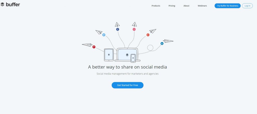
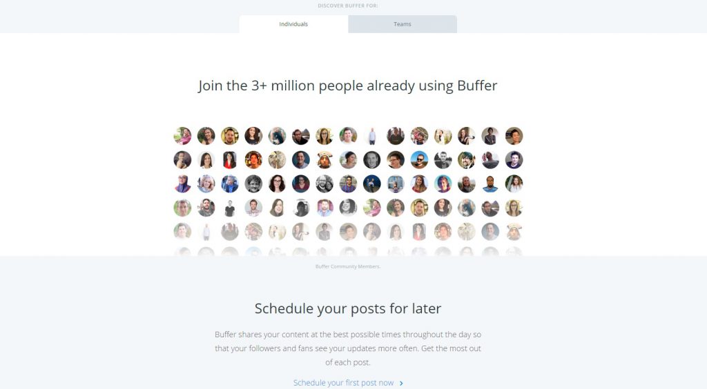
An excellent example of good use of white space is a website like https://buffer.com/. In this example, you can see that all the information you need is right there in a snazzy infographic type image which introduced what the service is. The following scroll is in turn, clean and easy to read with more information but it is not overwhelming. There is no clutter and no frustrating adverts to distract you from the service.
2) Choose The Right Colours
This may seem very dorky but take a look at this research on Kissmetrics.com about the importance of colour schemes on websites.
Initially, I just started reading it due to research for this article, but I found myself reading right through. Am I a dork?
I won’t spoil the fun for you – have a read; I can guarantee you will sigh “Ohh, that’s cool” as you are reading to yourself.
Who knew colour could be so important to user’s experience.
3) Page Speed Matters
Page speed is now a ranking factor in Google’s algorithm, and for good reason too! There is something painfully irritating when you come to a website that is slow, so painful. Even though it is only a few seconds to wait it makes a HUGE difference in the user experience.
According to this article on Tenfold.com, 57% of users who have to wait more than 3 seconds for their page to load will abandon the site. That is crazy, to think that you can lose a conversion just because of that!
We can probably blame mobile for this as now the majority of people use their mobiles for a large portion of their “online time”. People on the move don’t have time to wait.
User experience is key to Google rankings and so page speed plays a big part because if consumers are leaving your site because it is too slow, then your SERPS may be affected by this. The best examples of great load times are some of the big boys – such as Forbes or Amazon. A split second and the page has loaded.
Not sure if your page is fast enough? Check out Google’s free tool and see for yourself. There will be a lot of information and tips there on what you can do to improve your load time.
4) Attractive Calls to Action
Having a quality set of call to action buttons and words may seem a strange one to pin down to user experience but give me a second to explain this one.
At the end of the day the user is looking for information, right? Well, customer satisfaction is part of the user experience equation, and if your calls to action buttons evoke an emotional connection, then you are successfully given your readership the information they need because they are clicking the link to the information page.
However, if your CTA’s are poorly written and look suspicious, then they will not be clicking the link at all. Hence they will not find the information they want and leave your site.
Good CTA words to use;
- Start Today
- Sign Up Now
- Don’t Miss Out
- Get Started
The example below is from www.quicksprout.com which is a great place to learn about anything and everything, related to SEO and traffic.
The purpose behind a CTA is what the words are – CALL TO ACTION. Try and get your reader into the mindset of DOING something. If you manage to make an emotional connection, then you are on to a winner. Many studies show that by simply changing some colours around and mixing up words on CTA’s can increase conversion dramatically.
There is a great list over at wishpond.com where they go into incredible detail on CTA words.
5) Offer Something in Exchange for Actions
This one is a golden oldie – everyone loves to get something for nothing. However, give your readers something of quality. Something which they will get some use out of.
Let’s say for example you are giving away a free Ebook to build to your e-mail list, don’t just get a cheap PLR Ebook made up and pawn them off on your readers. People these days are quite smart at detecting regurgitated nonsense that is clearly sales oriented. They will feel cheated.
Why not give them something of quality and write something that you KNOW will give them the information they want. Write it yourself and make sure it is original, relevant and thorough.
Why give them something cheap when you can provide them with a good quality product that solidifies your trust and builds confidence in your brand and website?
6) Make Your Links Beautiful!
All links in your content have a purpose – either a monetary purpose or a UX (user experience) one. You should try and keep your links descriptive, but functional. Which one of these two links do you find more appealing?
See how I make money online here. Vs. Find Out How I Make Money Online
Once again, remember that your readers NEED/WANT information and your job is to make sure they receive it – a good solid and “clickable” link is part of this user experience.
I would recommend sticking with the colour blue. Blue hyperlinks have been around since the beginning of the Internet and I believe using any other colour will probably make people a little suspicious – unless it is a CTA button or something like that. But, if it is just a text link, stick with blue.
7) Use Bullet Point To Full Effect!
Readers LOVE bullet points. Let’s face it, none of us fancy reading too much these days – especially if we are looking for information about work or a chore of some sort. We just want to scan the page, find the information we need and close the browser.
Again, write the content with the user in mind. Use bullet points to make the page more scannable with clear and easy to understand subheadings;
Benefits of Using Bullet Points;
- Easier for your reader to quickly find the information they need.
- Easier to organise your content.
- Your page will look tidier, as opposed on one lump of text.
- Gives more authority to your content when making an important point.
See what I did there? Bullet points!
8) Use Images Carefully
Images can significantly increase the user experience of a website. Images are so powerful in conveying messages of all kinds, none more so than in a monetary way, which, let’s face it is the end goal here for most of us.
Have you ever come across a website that uses generic stock images? Do they fill you with confidence? No!
Regardless of your niche or business, images can drastically increase conversion because there is a connection between the trustworthiness of a website and the quality of their images. With the advent of responsive themes and buttons, this is now even MORE important than ever.
Another point to take note of is this. If you have a theme which utilises image sliders, such as Slider Revolution, be sure that the text does not get lost in the image. I see so many websites with great images but the text on the images themselves are almost the same colour, and you can’t read what the message is.
This is incredibly important if you have sales pages, for example, because this will affect your conversion rate.
9) Make You Headlines Descriptive & Captivating
The headlines you choose is a powerful way to keep your visitors engaged, not to mention the sub-headings because they keep the reader’s attention for longer!
What you want to do is to include the keywords that brought the consumer to your page in the first place because that is the information they are looking for. This is probably most relevant to your post/page title because that is the first thing they see when they enter your site.
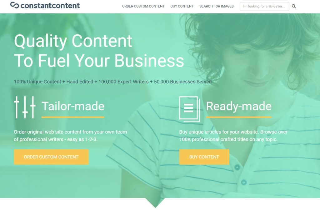
A great example is the homepage for constant-content.com – just a few simple word to describe their whole service.
10) Tracking What’s Hot and What’s Not
As bloggers, I think we do sometimes get consumed by keyword research, resulting in slightly skewed article subjects and directions. I often find myself “searching for the perfect keyword” rather than thinking – “What do people want to know about?”
Every niche, more or less, will have “new” products and services coming out every week – why not try and be the first to write about them??
You can use places like;
- Google Alerts
- Amazon HOT releases
- Muncheye Marketing Launches – ClickBank & JvZoo Launches
You would be forgiven for thinking that these will be very competitive and impossible to rank for but it is quite the opposite. There are SOOOO many keywords and possible angles to attack these product articles with – I will write a post about that next I think!
By getting ahead of the competition, you can gain a lot of momentum with your traffic. Not every product will be that popular and have many searches but a lot of them will – not to mention Google LOVES up to date and fresh content, what better way to impress the spider crawler bot than to write about the latest products and services!
Why does this increase your website’s user experience? Well, consumers want information. They want information about whatever they are about to use, purchase or download and they want it right now – if they receive good, reliable and fresh content, then they are happy.
11) Make Your Content Consistent
It is only natural to experiment a little bit with designs, themes, fonts and spacing – at least in the beginning. However, once you build a readership try your best to keep your website consistent. A sudden change in layout, font size and colour from one page to the next can throw a readers attention, and trust, to the point of exiting the site.
Try your best to keep font size, button colours, menu location heading sizes and letter spacing the same throughout the site. I know it can get tricky once you start racking up the post count but it all counts towards the user experience.
12) Find Your 404s
If you are not 100% sure what a 404 Page Error is then it looks like this;
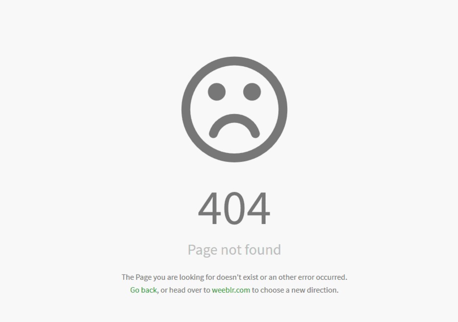
The anti-climax your user feels when they encounter one of these should not be underestimated. I have no doubt that 404s will end up costing you conversion if you do not keep on top of them. One here and there is inevitable, but it is very easy to catch them.
Use this free tool here to keep track of your 404s – 404 Checker
I am pretty sure we have all encountered one or two of these pages in our time and it is very annoying, not mention it makes your website lose credibility.
The best thing you can do is to set aside a funny 404 template, so at least you can control the disappointment. Here are some cracking examples of 404 pages.
13) Be Responsive & Mobile-Friendly
Being mobile friendly now is VITAL, not only for user experience but for SEO. You can check if your website is mobile friendly here with this free tool.
Devices like Ipads, mobile phones and tablets are now so popular that Google had to implement them into their algorithm updates. If your site doesn’t load up correctly on a mobile device then not only will your reader get annoyed and leave your website but you will lose ranking within the search engines.
I think we have all had that experience when we load up a website on our mobile and the images are cropped weirdly, or the text is unreadable. Very frustrating!
The majority of themes now are responsive, but you should always check because there will be one or two items on your website which may cause issues for users.
14) Be Active On Social Platforms
A great way to improve customer experience is by recognising them and interacting with them. Have you ever wondered why shop assistant say “Hi, if you need any help just let me know!” when you walk in a store? Well, they are making an emotional connection with you by being open and friendly. Sure, it can be annoying but it really does increase sales and most important – makes the customer feel valued.
Make your social accounts easy to reach and when you get comments and shares – acknowledge them. Like people’s comments and perhaps comment on a few of them. This will emotionally connect them to your brand and feel appreciated.

This is an incredibly powerful tool because you are subconsciously building trust with your users. If a consumer comes to your social account and sees no interaction, very few likes but a lot of articles being posted. Well, do you think that look is trustworthy? However, if they see a lot of articles with tonnes of shares, reactions and comments then that is solid GOLD!
This is fantastic for your user experience because it fills your readership with trust and confidence with your content and your brand.
15) Good Old-Fashioned Testing
Sometimes you need the cold, hard and painful truth. “Is my website any good?” No one likes to be criticised, but it can be very productive to pay for some constructive criticism.
You can try a service that offers real feedback on your website, such as UserTesting.com. They employ people from all over the world to navigate a site and give an honest opinion about their experience, and they are very thorough. They cover every aspect, some you probably would not even think about.
Trust me when I say this – It is going to hurt your feelings because chances are they will be critical. However, that is kind of the point behind it.
This could make the difference between having an irritating, difficult to navigate and low converting blog OR having a profitable, user-friendly and scalable website.
16) Avoiding Overwhelming Users With Data Entry
This one is short and sweet. If you have any part of your website where your reader fills out information, such as newsletter, sign up or a product purchase. Make the customer information forms etc. as SHORT as possible.

Having to put in 12 lines of personal information just to try a free app or get a free Ebook – NO THANK YOU!
Giving your users less work to do, when filling in forms, will definitely increase conversion.
17) Use Your Customer Testimonials
On a basic level, people are drawn to products that are recommended but others. So, customer testimonials are a fantastic way to reassure consumers before they buy that they are doing the right thing – especially if they are a first-time buyer.
This point has been proven many times over, and by having customer testimonials in clear view, your conversions will go up. Just make sure they are real! Buying customer reviews from Fiverr.com will not work because they are obviously fake and like I said before, people can tell these days.
18) Seamless Navigation Is A Must
Have you ever been on a website where you found it hard to navigate?
- “Where is the search bar?”
- “Why does the shop have such small pictures? I can’t see the product I want!”
- “I want to contact the author but the contact me page was hidden way down the bottom, in small print, next to the copyright text.”
It is a proven fact that poorly designed websites which are difficult to navigate have lower interaction rates and lower conversion rates. This point can be a hard one to grasp because if you are the author of a blog you may not see that your pages are hard to navigate.
It can be a difficult fact to see if you are too close to it to realise. This is where using a testing website, as I mentioned before, such as UserTesting.com can be useful.
19) Give Security Assurance
This one is pretty straight forward. Do you have an SSL certificate for your website? If your site has an HTTPS, as opposed to HTTP, then you have an SSL certificate, and your website is secure.
You do not need to be a rocket scientist to figure out that people trust the HTTPS more than the HTTP. This is VERY important if you have a store on your website where people purchase from. If you do not have a secure website, then you can find information about it here.
All hosting providers will have it available for you as well so check out your dashboard with your hosting provider.
20) Chat Availability
Having a person to chat to will satisfy your consumers. There is a certain level of “lack of human touch” when you shop online and having someone to answer your questions does help.
This is dependent on your niche. If you have a blog about smoothie recipes, then you probably do not need a chat facility, but if you sell handcrafted clothes or sports gear, then there will be questions about the products.
Giving your customers instant answers will definitely nudge them to having a more pleasant experience, not to mention spend more money!
21) Display Prices Clearly
This one a pet peeve of mine – give the total price immediately. There are so many sites out there which add-on “sales tax” and “extra delivery charges” after you go to checkout. If you are only buying one item it’s no big deal; you can just go elsewhere but if you have been browsing for an hour and chosen 10 items – then you suddenly get hit with added sales tax or something – that is irritating and misleading.
Offers such as “Free, plus shipping & handling” should just be banned – people do genuinely believe they are getting a “FREE” item, even though the shipping and handling is 3x what it would normally be! Clicking in a hurry, they pay before they realise they just paid $15 for a $5 t-shirt.
Be upfront about the prices and keep things on an even playing field. That will keep your customers happy.
22) Have Proof of Authenticity
If you sell items like watches or fashion items then try and get a certification from the manufacturer to say you are a verified merchant. This will boost your sales like mad, PLUS, make your consumers much more confident with your site.
With items that are notorious for fakes and forgeries, I think it is important to put your users at ease immediately.
So…
There you have it – 22 ways to improve user experience on your websites! I hope you find some useful tips here today and thank you so much for taking the time to visit my site!
Did I miss any? Are there any methods that you use that you find effective? Leave a comment below!
Thanks for sharing these great tips. I agree with your points as I have been using these strategies as a professional website designer. I notice one of your points is to reduce the bounce rate. Do you find this automatically drops in value naturally (which is a good thing) if you apply all of these techniques in a website?
Absolutely! If you give your readers a reason to stay longer then your bounce rate will drop and Google loves that. However, all users will bounce quicker for different reasons. That is why it is important to be as versatile as possible when it comes to user experience to try and catch people from all angles.
One person may get irritated by your small font and exit the site whereas another may find your post title too misleading. It can be hard to please everyone but by covering as many avenues as possible, you stand a good chance.